This NSDC Data Science Flashcards series will teach you about data visualizations, including scatterplots, histograms, and heat maps. This installment of the NSDC Data Science Flashcards series was created by Varalika Mahajan and Sneha Dahiya. Recordings were done by Aditya Raj, Sneha Dahiya, Lauren Close, and Emily Rothenberg. You can find these videos on the NEBDHub Youtube channel.
In this video, we’ll dive deep into one of the most versatile tools in a data analyst’s toolkit – the scatter plot.
The scatter plot is like a magic wand that reveals hidden relationships in data. It’s simple yet powerful.
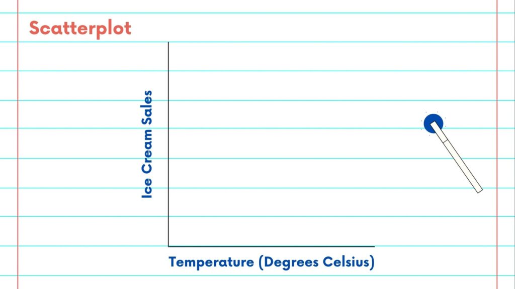
Let’s break it down. At its core, a scatter plot is a graph that displays individual data points on a two-dimensional plane. Each point represents one observation, and the position of the point is determined by two variables. Your graph might highlight the correlation between measurements like height and weight, or time and distance, for instance.
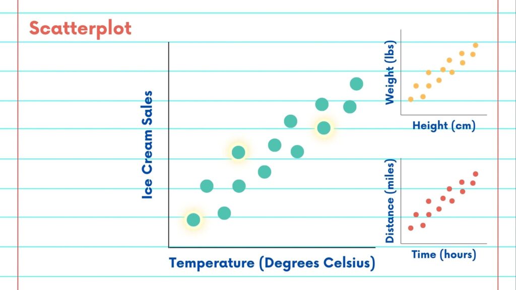
Again, scatter plots are perfect for revealing hidden relationships between your two variables. You might use a scatter plot to analyze exam scores. The way the dots are plotted can showcase the connection between study time and performance.
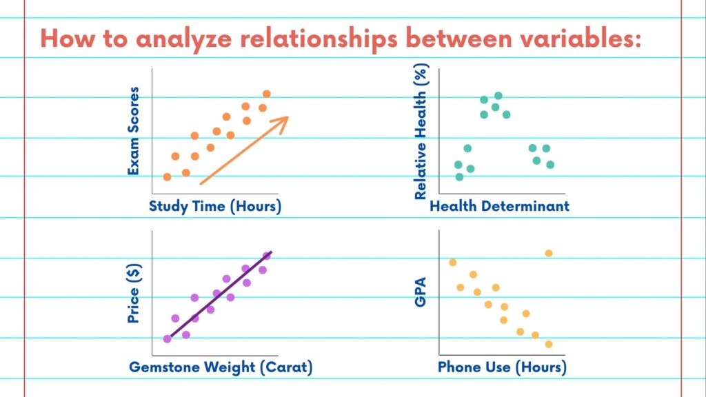
What can you learn from a scatter plot? The first thing to look for are patterns and trends. If the points seem to align in a particular way, it suggests a relationship. A clear line of points may indicate a linear correlation, which you can quantify using statistics.
Clusters of points can reveal subgroups within your data. In healthcare, for instance, a scatter plot might help identify distinct patient groups with specific characteristics.
Adding a trend line to your scatter plot allows you to quantify the relationship. This line can help make predictions, understand causality, and uncover hidden insights.
Scatter plots also help you identify outliers—those data points that stand apart from the rest. These anomalies can be crucial in various fields, from fraud detection to quality control.
The true power of a scatterplot lies in its simplicity and versatility. You can customize your scatter plot with labels, colors, and markers to provide additional context. Adding labels can make the plot more informative and comprehensible.
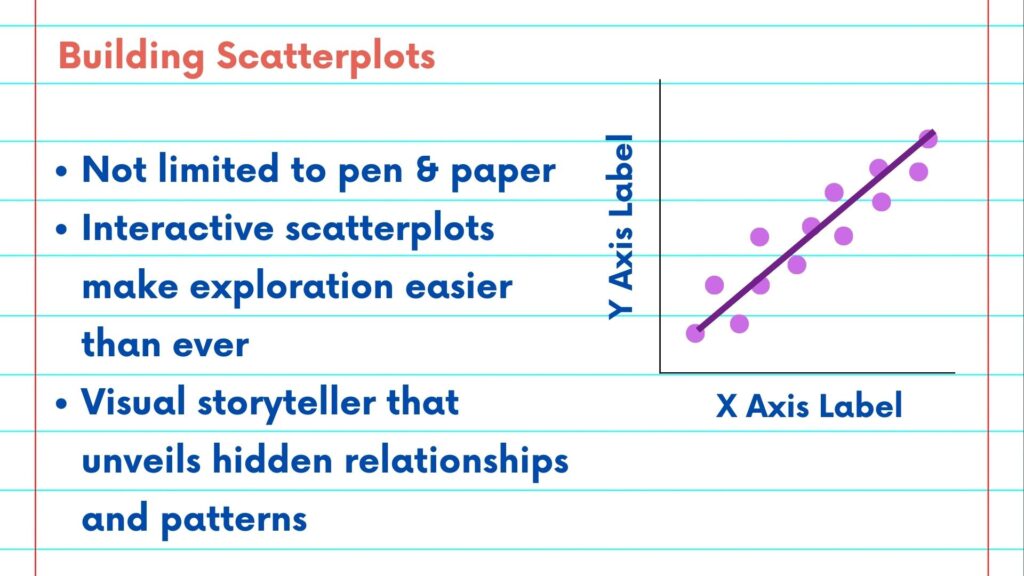
Scatter plots are not limited to pen and paper. Today, interactive scatter plots in data visualization tools make exploration easier than ever.
Overall, you could say that the scatter plot is a data analyst’s best friend, a visual storyteller that unveils relationships and patterns hidden within your data.
Please follow along with the rest of the NSDC Data Science Flashcard series to learn more about data visualizations.