This NSDC Data Science Flashcards series will teach you about data visualizations, including scatterplots, histograms, and heat maps. This installment of the NSDC Data Science Flashcards series was created by Varalika Mahajan and Sneha Dahiya. Recordings were done by Aditya Raj, Sneha Dahiya, Lauren Close, and Emily Rothenberg. You can find these videos on the NEBDHub Youtube channel.
In this video, we’re about to journey into the world of line graphs, a fundamental tool in understanding trends over time.
The line graph, also known as the line chart, is a visual storyteller that shines a spotlight on changes and trends over a series of time points. It’s a timeless favorite in data visualization.
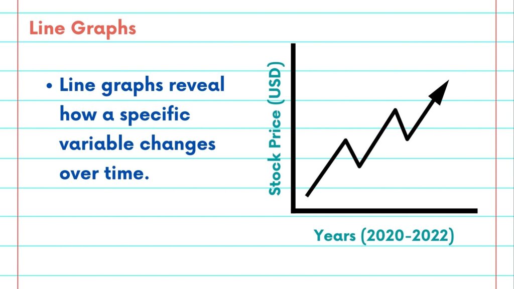
Let’s dive into the basics. At its core, a line graph is a visual representation of data points connected by straight lines. The horizontal axis typically represents time, and the vertical axis showcases the values you’re interested in, such as temperature, sales, or stock prices.
Line graphs are exceptional for revealing how a specific variable changes over time. If you’re tracking stock prices, for example, a line graph will illustrate the price’s journey with precision.
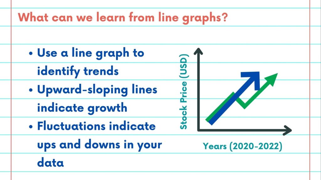
What can we learn from a line graph? The most evident use of a line graph is to identify trends. An upward-sloping line indicates growth, like a company’s increasing revenue over several years.
Line graphs also help track fluctuations, showcasing ups and downs in data. This is particularly useful for understanding the volatility of stock prices or the seasonality of sales.
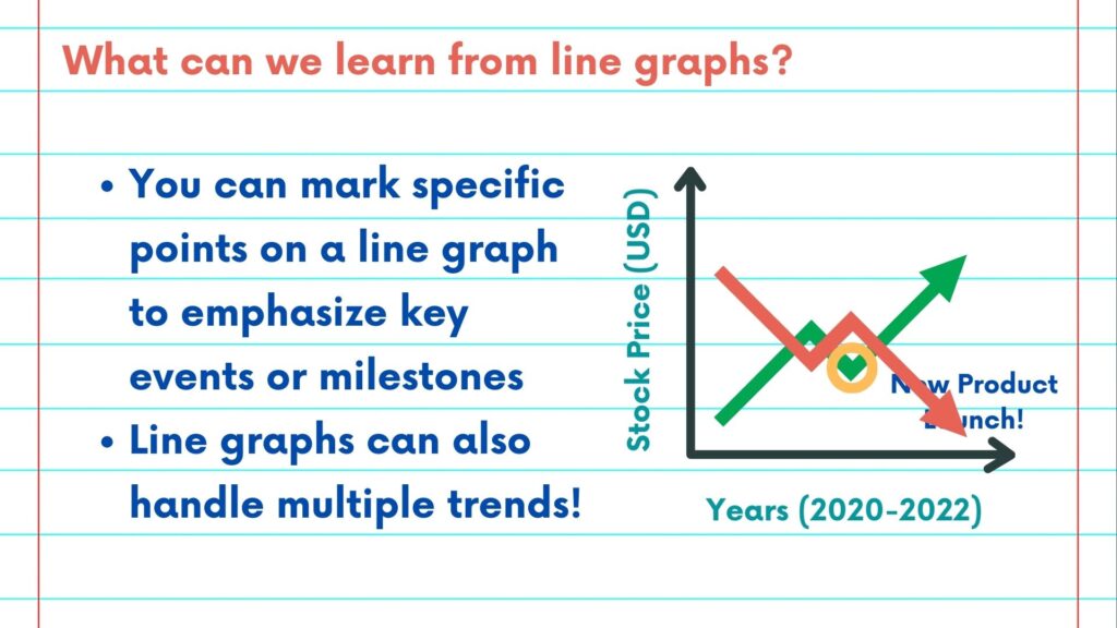
What about individual points of interest? You can mark specific points on a line graph to emphasize key events or milestones. For example, marking the date a new product was launched within a sales chart can provide valuable insights.
Line graphs can handle multiple data series simultaneously. Comparing multiple trends within one graph makes it easier to spot correlations and differences.
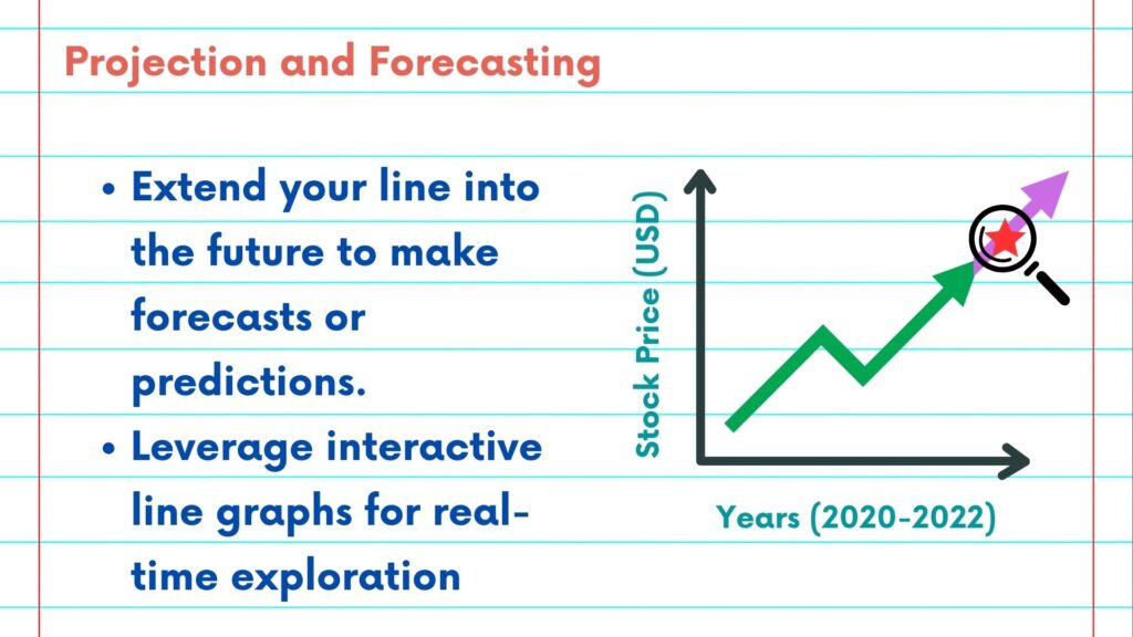
Projection and forecasting are special skills of line graphs. With a line graph, you can extend your line into the future to make forecasts or predictions. This is particularly helpful for predicting trends in data, like future population growth or revenue projections.
Line graphs have evolved beyond the realm of paper and pen. Interactive line graphs in modern data visualization tools allow for real-time exploration and interaction, enabling users to zoom in, hover for details, and tailor their analysis.
To conclude, line graphs are your time-traveling companions in data analysis, revealing trends and patterns that help you make informed decisions.
Please follow along with the rest of the NSDC Data Science Flashcard series to learn more about data visualizations.