This NSDC Data Science Flashcards series will teach you about data visualizations, including scatterplots, histograms, and heat maps. This installment of the NSDC Data Science Flashcards series was created by Varalika Mahajan and Sneha Dahiya. Recordings were done by Aditya Raj, Sneha Dahiya, Lauren Close, and Emily Rothenberg. You can find these videos on the NEBDHub Youtube channel.
In this video, we’re about to embark on a journey into the captivating world of heat maps, a powerful tool for understanding complex data patterns.
Heat maps are visual marvels that convey information through color and intensity variations. They’re particularly effective when you need to make sense of dense, multidimensional data.
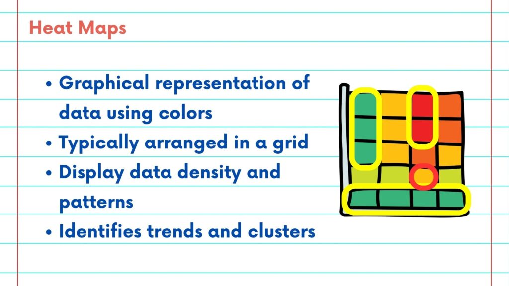
Let’s uncover the basics. At its core, a heat map is a graphical representation of data values using a color spectrum. It’s typically arranged in a grid, and each cell’s color intensity corresponds to the magnitude of the data it represents.
Heat maps excel in showcasing data density and patterns. For example, when analyzing website traffic, a heat map can vividly illustrate which sections of a webpage receive the most attention.
What can we decipher from a heat map? Heat maps are superb for identifying trends and clusters. When data points clump together with similar values, you can spot patterns and outliers instantly.
Heat maps are ideal for comparative analysis. By comparing data across multiple categories or regions, you can quickly identify strengths, weaknesses, and opportunities.
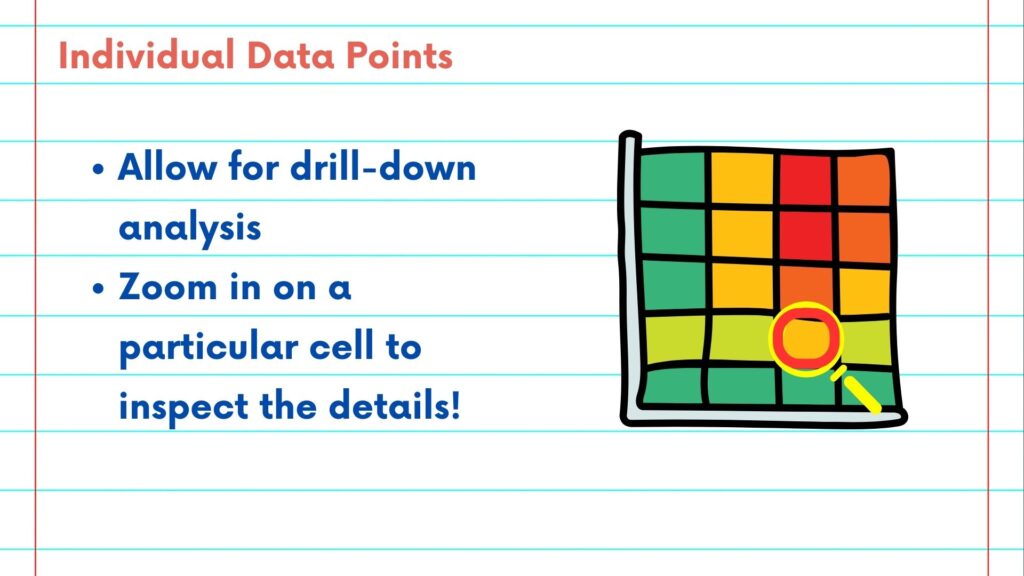
What about individual data points? Heat maps allow for drill-down analysis. You can zoom in on a particular cell to inspect the details and discover the underlying data.
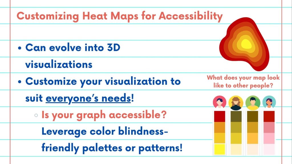
For complex, multidimensional data, heat maps can evolve into 3D visualizations. This provides insight into relationships within data elements.
Customization – tailoring your heat map to your needs. You can customize your heat map’s color scale to suit your analysis. Whether you’re highlighting hotspots of activity or cool areas of low engagement, it’s all at your fingertips.
Modern heat maps offer more than just static images. Interactive heat maps allow for real-time exploration and interaction, making it easier to pinpoint specific details or track changes over time.
To conclude, heat maps are the artists of data visualization, painting intricate patterns and relationships for your analytical canvas.
Please follow along with the rest of the NSDC Data Science Flashcard series to learn more about data visualizations.