This NSDC Data Science Flashcards series will teach you about data visualizations, including scatterplots, histograms, and heat maps. This installment of the NSDC Data Science Flashcards series was created by Varalika Mahajan and Sneha Dahiya. Recordings were done by Aditya Raj, Sneha Dahiya, Lauren Close, and Emily Rothenberg. You can find these videos on the NEBDHub Youtube channel.
This series will break down data science topics in simple terms that you can leverage throughout your data science journey.
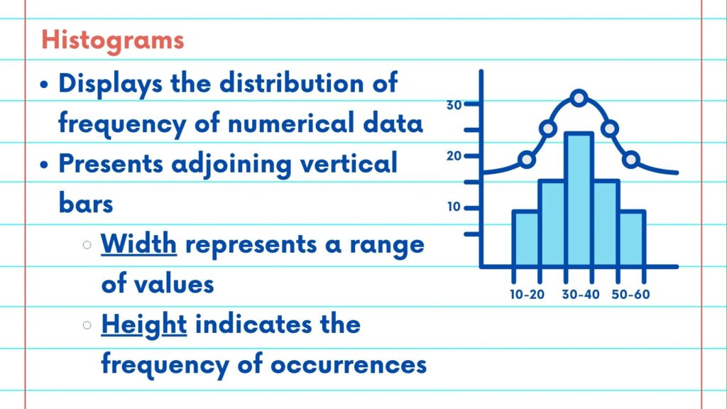
In this video, we will explore histograms. Histograms are a fundamental tool for visualizing the distribution of frequency of numerical data. They provide a comprehensive representation of data patterns, making them a quintessential part of data analysis and pre-processing.
Histograms present data in the form of adjoining vertical bars, with the width of each bar representing the range of values and the height indicating the frequency of occurrences within that range.
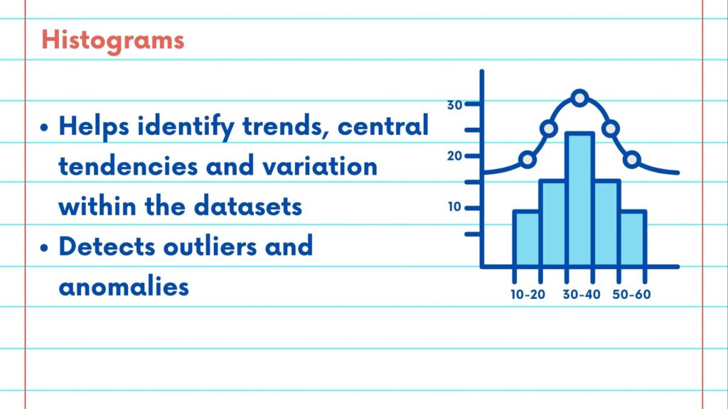
Histograms showcase the distribution of numerical data and help us identify trends, central tendencies and variation within the datasets. We can also detect outliers and anomalies while studying the plotted chart.
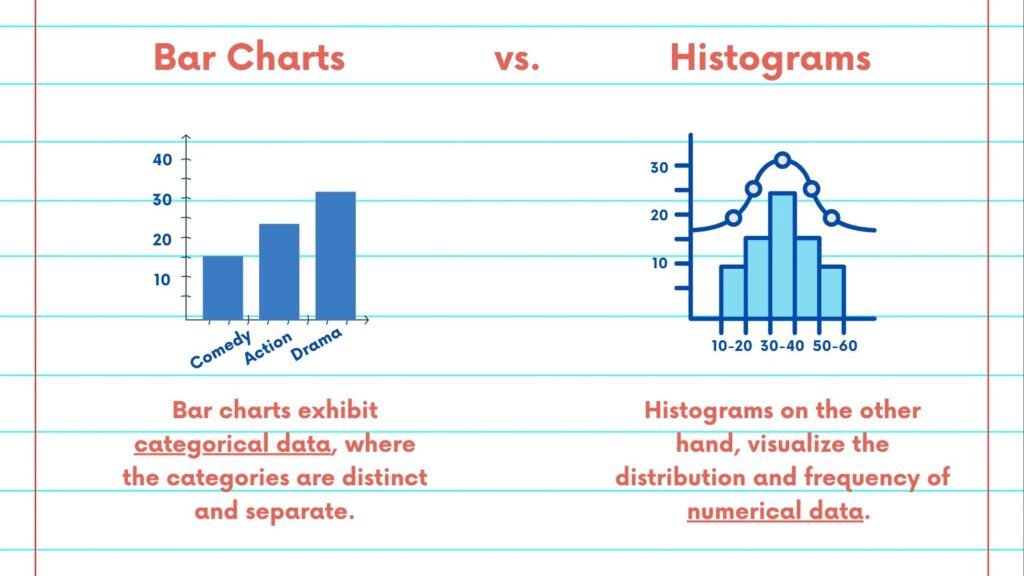
Bar charts and histograms look similar in presentation of data but the key difference is the type of data they represent and summarize. Bar charts are used to exhibit and compare categorical data, where the categories are distinct and separate. Histograms on the other hand, visualize the distribution and frequency of numerical data.
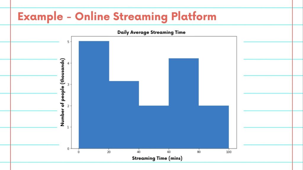
Now, let us take an example of an online streaming platform. As a part of the analytics team, we want to know the average time spent by users daily on the platform. To get a visual summary of the frequency and patterns of the average time spent, we can plot a histogram.
As you can see from the chart, on average users spent either 0-20 mins or 60-80 minutes daily on the platform. This inference can further be used to update content and accessibility on the streaming platform. For example the reason for the high frequency in the 0-20 min bucket may be that the content is not as engaging as the team had hoped. To fix this, we may recommend adding new content based on viewer feedback to drive engagement.
Please follow along with the rest of the NSDC Data Science Flashcard series to learn more about data visualizations.