This NSDC Data Science Flashcards series will teach you about data visualizations, including scatterplots, histograms, and heat maps. This installment of the NSDC Data Science Flashcards series was created by Varalika Mahajan and Sneha Dahiya. Recordings were done by Aditya Raj, Sneha Dahiya, Lauren Close, and Emily Rothenberg. You can find these videos on the NEBDHub Youtube channel.
This series will break down data science topics in simple terms that you can leverage throughout your data science journey.
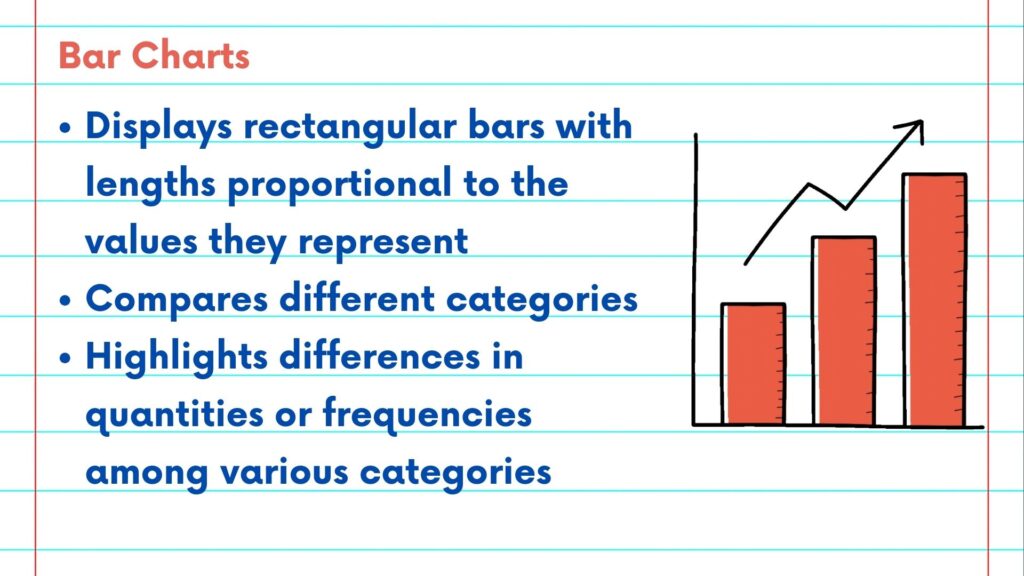
A bar chart displays data using rectangular bars with lengths proportional to the values they represent.
The chart can be used to compare different categories or groups. They are effective in highlighting differences in quantities or frequencies among various categories which can be leveraged for data driven decisions. Additionally, they help us identify the most important and dominant categories within a dataset.
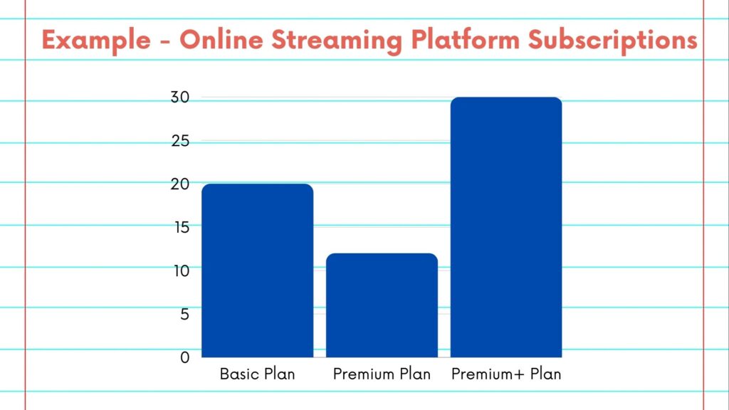
Let us take an example of an online streaming platform offering three different plans to its users. The Data Analytics team wants to visualize the distribution of users across these plans to analyze their overall performance. We can plot a bar chart to compare the number of users registered across different plans.
From the bar chart, we can see that most users are in the Premium+ category and the least users have bought premium subscription. One potential reason could be that users are upgrading from the basic version to the premium+ version in order to receive the best services. Thus, for business purposes, this bar chart highlights the success of the tiered subscription plans especially for converting users from Basic plan to Premium+ plan.
We welcome you to follow along with the rest of the NSDC Data Science Flashcard Video Series to learn more about the data science pipeline, data science ethics, and additional topics to support your journey.
Please follow along with the rest of the NSDC Data Science Flashcard series to learn more about data visualizations.