This NSDC Data Science Flashcards series will teach you about data visualizations, including scatterplots, histograms, and heat maps. This installment of the NSDC Data Science Flashcards series was created by Varalika Mahajan and Sneha Dahiya. Recordings were done by Aditya Raj, Sneha Dahiya, Lauren Close, and Emily Rothenberg. You can find these videos on the NEBDHub Youtube channel.
In this video, we’ll explore the fascinating concept of “Which Visualization for What Type of Data?”. Data visualization is an art, a science, and a critical part of data analysis. It’s not just about creating pretty charts; it’s about finding the most effective way to convey your data’s message.
Imagine you have a diverse dataset, filled with numbers, categories, and even geographical data. How do you choose the right visualization to tell your data’s story?
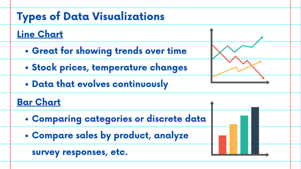
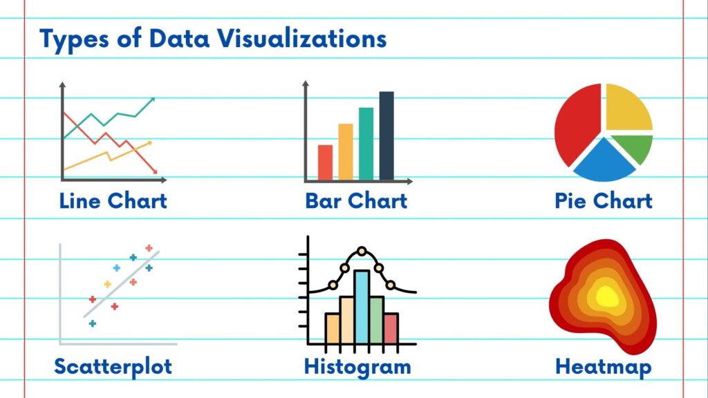
Let’s start with the basics. Line charts are great for showing trends over time. They’re perfect for visualizing stock prices, temperature changes, or any data that evolves continuously.
Bar charts are excellent for comparing categories or discrete data. You can use them to compare sales by product, analyze survey responses, and many other scenarios.
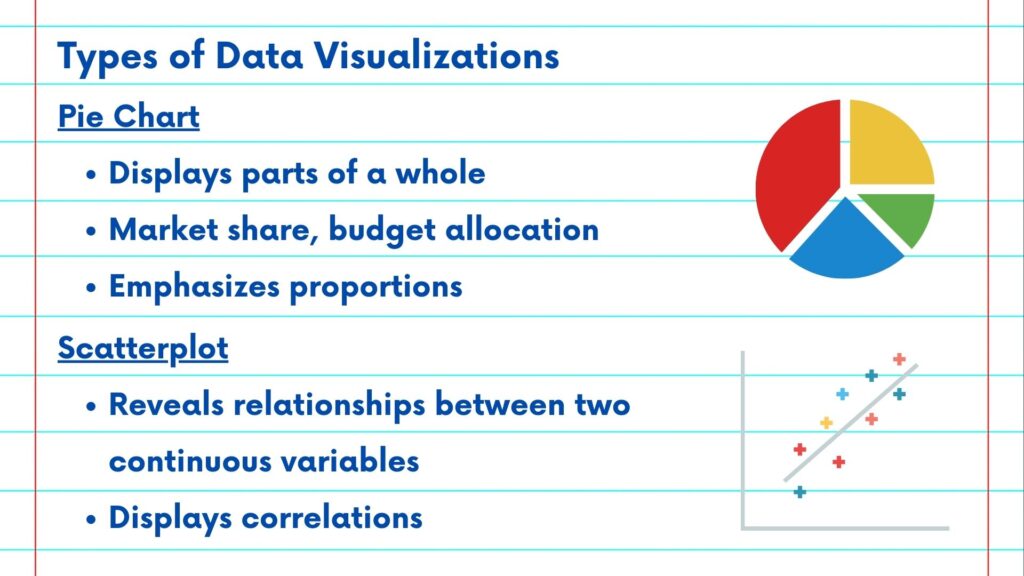
But what about parts of a whole? Pie charts help you see how a whole is divided into parts. Use them to show market share, budget allocation, or any situation where you want to emphasize proportions.
Scatter plots reveal relationships between two continuous variables. They’re ideal for displaying correlations, like the relationship between height and weight.
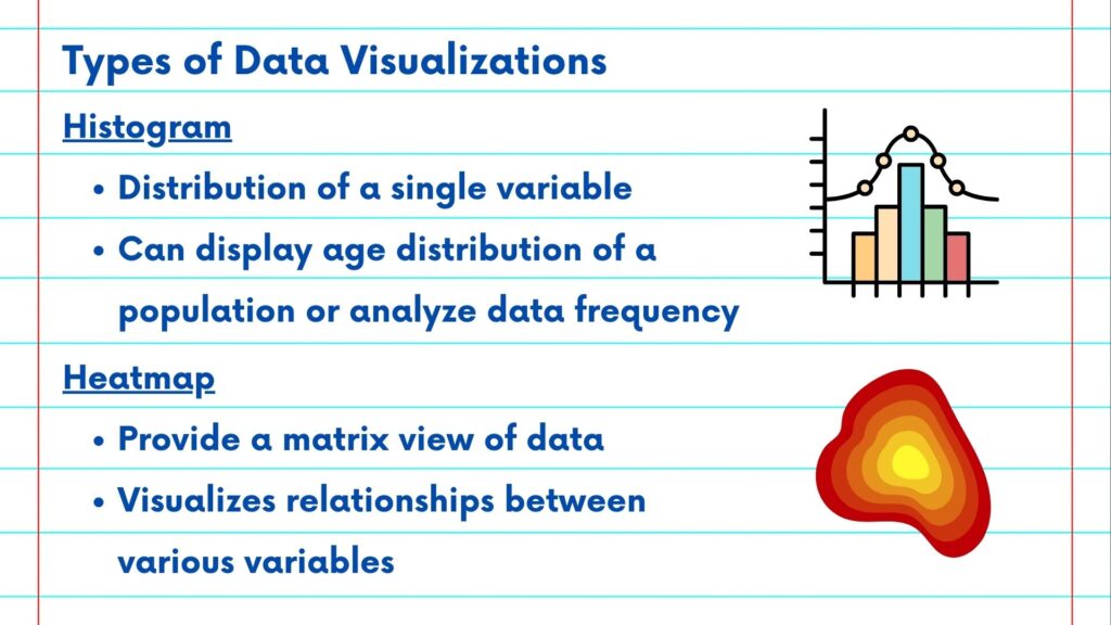
Histograms are your go-to for visualizing the distribution of a single variable. Use them to show the age distribution in a population or analyze any continuous data’s frequency.
Heatmaps provide a matrix view of data and are excellent for visualizing relationships between variables. Use them to display correlation matrices, analyze complex datasets, or even show employee performance.
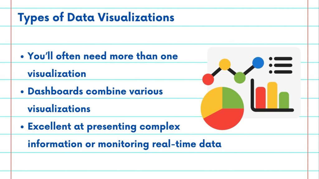
The choices are vast, and often, you’ll need more than one visualization. Dashboards combine various visualizations to provide a comprehensive view of your data. They’re excellent for presenting complex information or monitoring real-time data.
So, which visualization do you choose? Well, it depends on your data and your message. Consider your data type, your goals, and your audience. Be open to experimentation, and remember that the best visualization is the one that tells your data’s story most effectively. We’ll be discussing each of these in detail in the upcoming videos.
Please follow along with the rest of the NSDC Data Science Flashcard series to learn more about data visualizations.