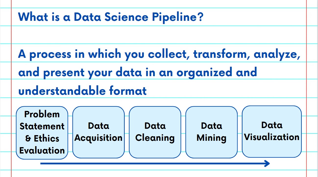
The NSDC Data Science Flashcards series will teach you how the data pipeline is developed for data science projects. This installment of the NSDC Data Science Flashcards series was created by Sneha Dahiya, a graduate student majoring in Business Analytics. You can find these videos on the NEBDHub Youtube channel.
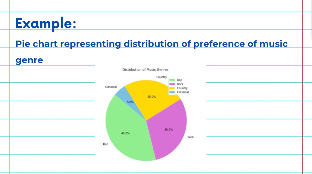
The fifth step in the Data Pipeline is Data Visualization. Data Visualization is an important tool and step for any data analytics and data science project.
Visual representations of our data allow us to observe different patterns and trends. Data visualizations can also help you present your findings quickly to other project stakeholders. We can use different charts and graphs to plot data points, depending on the type of data and the type of story you want to tell. These include: tables, bar charts, pie charts, line charts, histograms, and heatmaps.
There are many softwares and programming languages that we can use to plot these charts such as Python, R, Excel, Tableau, and PowerBI.
Please follow along with the rest of the NSDC Data Science Flashcard series to learn more about the Data Pipeline.