Guest post by Dr. Sara Stoudt, Lecturer in Statistical and Data Sciences Program, Smith College
We’ve all been acutely aware of screens lately; we cannot seem to escape them. As statisticians and data scientists we’re stereotypically buried in our spreadsheets and charts anyway, but who do we exclude when communicating with data on a screen, and how do we think beyond the typical data visualizations we’re used to *seeing*?
As part of my Communicating with Data class at Smith College in the fall, students and I thought about how to make data visualizations more accessible through the use of different senses. This data physicalization unit of the course involved collaboration across the entire campus. Here’s how it worked:
- Charlene Shang Miller from the Smith College Museum of Art got us thinking about audience perception and interaction with art and their labels.
- Andrea Bajcsy talked to us about her undergraduate and graduate research on accessibility technology.
- The Design Thinking Initiative generously provided students with “maker kits.” An example material list can be found here.
- Laura Lilenkamp and Emily Norton of the Design Thinking Initiative spoke to the class about design thinking and rapid prototyping.
- Laura and Emily helped us practice prototyping for two different audiences: children and folks with visual impairments.
- Students experimented with their computer’s default screen reader and considered captions and alt-text as ways to augment visual information.
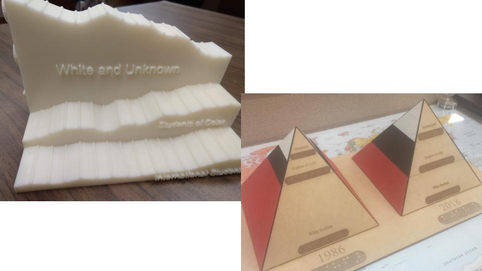
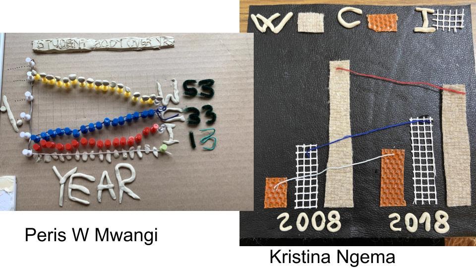
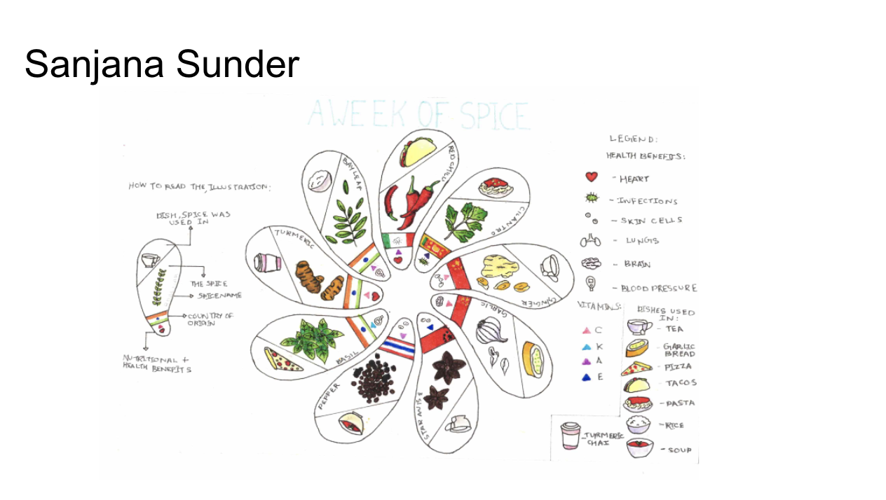
- Students used the materials in their kits and items found around their homes to create their own data “phys,” visualizing data about Smith College demographics.
- Coming back together in groups, they shared and learned from one another’s designs.
- After talking about the strengths of multiple approaches, students made a second prototype, incorporating new ideas into their original design.
- Students then voted on the strongest prototypes to move forward into a more formal product.
- Laura, Emily, and I grouped similar designs together to create a smaller number of teams (for feasibility, this was a big class!).
- These teams met with Eric Jensen and Dale Renfrow from the Center for Design and Fabrication to talk about how to machine a formal version of their designs (think laser cutters and 3D printing).
- Eric and Dale iterated on the designs with the students and helped them obtain the more formal measurements needed for machining.
- As an added bonus, we also took advantage of another sense beyond sight and touch. We explored sonification, turning numbers into sound, of the same data.
Check out student creations, shared with permission, at every step of the process here. Want to do a similar activity in your own class? Here are instructions and a rubric that you can use as a starting point.
What did students think?
When asked in the final course evaluation: “How effective was the emphasis on accessibility in helping you understand data communication concepts throughout the course?” all respondents answered positively.
“I had never thought about how to communicate data in any way other than just through typical graphs and visualizations, and this really expanded my understanding of data communication. It led me to think about things from many different perspectives.”
“I think accessibility is very important when designing something, so it helped me understand why we made certain decisions when communicating data to someone else.”
“I liked the emphasis on accessibility, since it’s such a large issue that’s difficult but important to tackle.”
There is always still room for improvement though.
“I liked it, but wish more examples of very good accessible visualizations had been discussed in class (with an explanation of what makes them super accessible).”
“Very good, except I have an older computer so trying to download different applications, papers, and video recordings was a little difficult (and frustrating).”
What are my goals for next time?
- Collaborate more: I am by no means an expert in accessibility and design, but I’d love to learn from others and have them share their expertise and experience with future classes. Reach out!
- Read more: Some items on my reading list include Sara Hendren’s “What Can a Body Do?,” Lindsey Kopacz’s “The Bootcampers Guide to Web Accessibility,” Sara Lenzi and Paolo Ciuccarelli’s “Intentionality and design in the data sonification of social issues,” and recent Data Visualization Society’s Medium posts. Send any other reading recommendations my way.
- Explore lighter-weight technology: This is an accessibility challenge in itself. There were plenty of technological glitches this semester due to differing resources, and I want to experiment more to have more informed guidance for students in those situations or at least have better backup plans in place to help us not lose learning momentum over logistics.
Sara Stoudt is a statistician with research interests in ecology and the communication of statistics. Stoudt received her bachelor’s degree in mathematics and statistics from Smith College and a doctorate in statistics from the University of California, Berkeley. Her graduate work involved evaluating species distribution and abundance models under model mis-specification. While at Berkeley she was also a Berkeley Institute for Data Science Fellow and worked with Professor Deborah Nolan to teach statistical writing.