This NSDC Data Science Flashcards series will teach you about time series analysis, including data preprocessing, decomposition, plots, and forecasting. This installment of the NSDC Data Science Flashcards series was created by Varalika Mahajan. Recordings were done by Aditya Raj. You can find these videos on the NEBDHub Youtube channel.
In this video, we’ll explore the importance of Time Series Plots in understanding and visualizing time-dependent data.
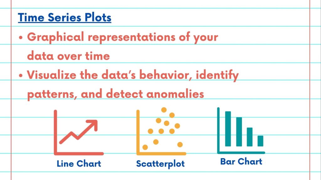
Time Series Plots are graphical representations of your data over time. They help you grasp the overall behavior of your data, identify patterns, and detect anomalies.
There are various types of Time Series Plots, including line plots, scatter plots, and bar plots. Each serves a specific purpose. For example, a line plot is excellent for showing the trend, while a scatter plot can reveal relationships between variables.

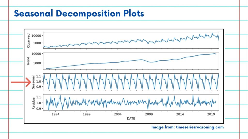
Seasonal decomposition plots display the original time series, the trend component, the seasonal component, and the residual component separately. They provide a comprehensive view of your data’s structure.
Seasonal plots, on the other hand, focus solely on the seasonal component. They help you understand how seasonality impacts your data and whether it follows a regular pattern.

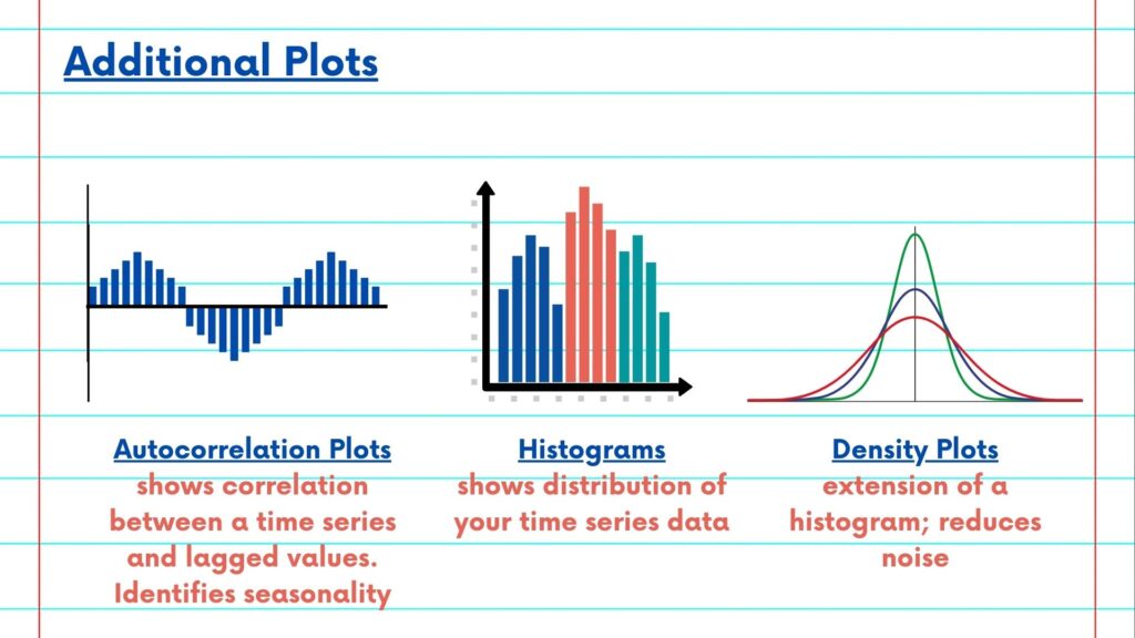
Autocorrelation plots show the correlation between a time series and its lagged values. They are crucial for identifying seasonality and selecting appropriate forecasting models.
Histograms and density plots help you understand the distribution of your time series data. This is essential for modeling assumptions and detecting outliers.
Annotations can be added to highlight specific events or anomalies in your data, making your plots more informative.
By using Time Series Plots effectively, you can gain valuable insights into your data, which is the first step towards accurate analysis and forecasting.

Please follow along with the rest of the NSDC Data Science Flashcard series to learn more about time series analysis.
